The Best Wedding-Themed Fonts and Colors for a Stylish Countdown Widget
The Best Wedding-Themed Fonts and Colors for a Stylish Countdown Widget
Your wedding day is coming. You've planned the guest list, booked the venue, and figured out the seating chart. But have you thought about how your wedding countdown will actually look? That little widget counting down the days, hours, and minutes—it's often the first thing guests see when they visit your wedding website. Getting it right means choosing fonts and colors that feel romantic, personal, and absolutely unmissable. A countdown widget that looks carelessly slapped together can undermine months of planning, while one that's thoughtfully designed becomes part of your wedding brand itself.
The stakes might seem small, but design details matter. Your countdown widget is like the ribbon around your wedding invitations—it signals taste and intentionality. That's why choosing the right combination of fonts and colors isn't about following rigid rules; it's about understanding what works visually and psychologically to capture the excitement and elegance of your big day.
Why Fonts Matter More Than You Think
Typography isn't just about making text readable. The right font communicates emotion before anyone reads a single word. When guests see your countdown, you want them to feel the occasion—whether that's romance, joy, sophistication, or celebration.
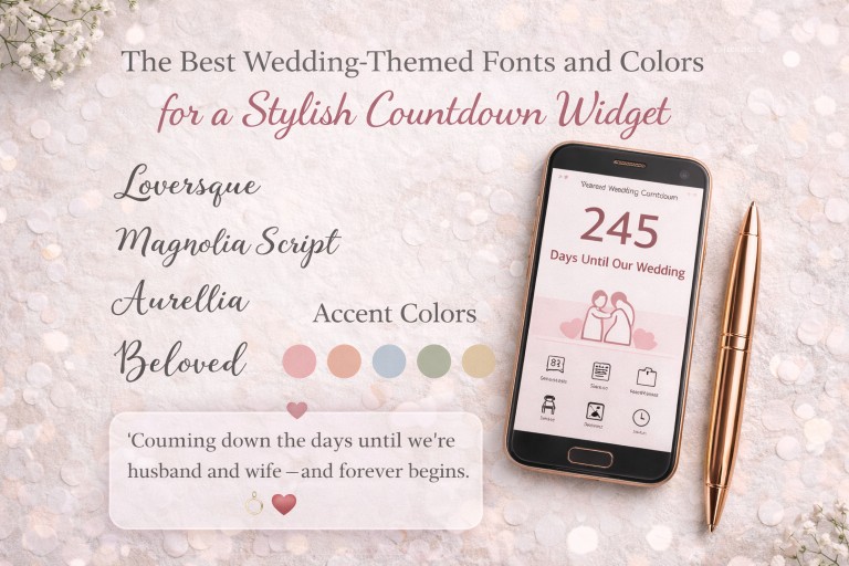
Script and Serif Fonts are the traditional workhorses of wedding design. A delicate script font like Brush Script, Allura, or Playfair Display conveys timeless elegance and femininity. These fonts work beautifully for the "days until" label or decorative elements around your countdown numbers. However, here's the key: use scripts sparingly. A countdown timer surrounded entirely in flowing script becomes hard to read and loses its primary function—to communicate urgency and clear dates.
The Numbers Themselves Need Clarity. This is where sans-serif fonts like Montserrat, Poppins, or Lato shine. These modern, clean fonts ensure that the actual countdown numbers (2 days, 14 hours) are instantly readable. The contrast between elegant script labels and crisp numeric displays creates visual hierarchy and sophistication. Guests quickly understand what they're looking at while appreciating the overall aesthetic.
Pairing Strategy: Use a decorative script for small text like "Days Until Our Wedding" and switch to a geometric, clean sans-serif for the numbers themselves. This combination is timeless and functional. You could use something like Playfair Display (classic serif) for headlines paired with Montserrat (modern sans-serif) for the countdown numbers—a pairing that feels elevated without sacrificing readability.
The Psychology Behind Wedding Color Choices
Color creates instant emotional associations. A countdown widget in the right colors feels cohesive with your overall wedding aesthetic and triggers the right feelings in your guests.
The Rose Gold and Blush Palette has dominated wedding design for years, and for good reason. Rose gold feels warm, luxurious, and slightly playful—perfect for modern weddings. Pair it with soft blush (a pale pink), cream, or white, and you have a palette that feels simultaneously sophisticated and romantic. The key is using rose gold as an accent—in borders, icons, or around the numbers—rather than as your main background, which would be overwhelming.
Jewel Tones for Dramatic Impact. If rose gold feels too predictable for your taste, consider deeper colors: navy, emerald, sapphire, or burgundy. These colors photograph beautifully and feel luxurious without being overdone. A countdown widget with navy as the main background and gold accents feels regal and memorable. Pair these with light cream or white text for maximum readability.
Classic White and Black Never Disappoint. A white background with black countdown numbers is stark, modern, and completely readable. Add a single accent color—a thin line in rose gold or a subtle pattern in a jewel tone—and you've created something that feels intentional rather than boring. Many modern wedding websites use this minimalist approach specifically because it keeps the focus on the essential information.
Seasonal Consideration Matters. Summer weddings often lean toward pastels and bright complementary colors. Spring weddings might use soft greenery tones with gold. Winter celebrations often embrace deep jewel tones and silver or white. Fall weddings look gorgeous with terracotta, burnt orange, and champagne gold. Your countdown widget should echo these seasonal feelings to feel integrated with your overall wedding aesthetic.
Practical Color Combinations That Work
Let's talk about real-world color combinations that create impact without clashing:
• Blush Pink + Charcoal + Gold: Romantic and modern simultaneously
• Navy + Cream + Silver: Timeless and elegant
• Sage Green + Ivory + Rose Gold: Organic, trendy, and sophisticated
• Black + White + Emerald Green: Dramatic and unforgettable
• Champagne Gold + Soft Taupe + White: Understated luxury
Each of these combinations works because they pair a strong base color with a contrasting accent and a neutral. This three-color approach prevents your countdown from looking either too matchy or too busy.
Making Your Countdown Widget Truly Stylish
The font-color combination is just the foundation. True style comes from thoughtful implementation. A countdown widget looks polished when there's breathing room—generous padding around the numbers, white space that lets the design breathe, and visual elements that guide the eye naturally.
Add subtle decorative touches: perhaps small icons (rings, flowers, hearts) in your accent color, or a thin border that echoes your invitations. Some couples incorporate their wedding hashtag or a motivational phrase above or below the countdown. These touches personalize your widget and make it memorable.
Typography size matters too. Your main countdown numbers should be large and impossible to miss. Secondary information like the countdown labels can be smaller but still readable. This visual hierarchy keeps your design elegant and prevents everything from screaming for attention at the same time.
Final Thoughts: Design That Reflects Your Celebration
Your wedding countdown widget is more than a functional timer—it's an ambassador for your wedding style. The fonts and colors you choose set the tone for what guests can expect when they arrive. Whether you opt for delicate scripts paired with rose gold accents or bold sans-serifs with jewel tones, the goal is the same: create something that feels unmistakably yours while remaining clear, beautiful, and functional.
The best combinations aren't about following trends; they're about understanding what makes you feel excited about your wedding day and translating that feeling into visual form. When your countdown widget looks as thoughtfully designed as every other element of your celebration, your guests will notice—and they'll appreciate the attention to detail that makes your wedding day feel special before they even arrive.